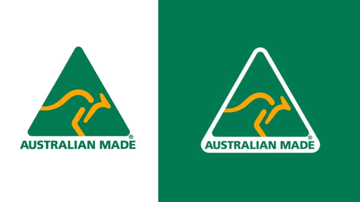
In the volatile world of corporate identity, where aesthetic trends shift as rapidly as consumer attention spans, forty years is an eternity. Most brands consider themselves fortunate if a visual identity survives a decade without a high-profile "refresh" or a complete strategic overhaul. Yet, the Australian Made logo—a striking green triangle framing a stylized gold kangaroo—has not only survived for four decades; it has thrived, becoming a permanent fixture of the national psyche.
While global corporations spend millions on focus groups and consultants to engineer "authentic" brand narratives, the Australian Made mark achieved iconic status through simplicity, speed, and a profound understanding of visual communication. In an era where many logos are mired in complex, over-explained metaphors, the Australian Made mark stands as a masterclass in design restraint.
The Genesis: A Design Born of Necessity
The story of the logo begins in 1986. Under the administration of Prime Minister Bob Hawke, the Australian government sought to bolster local manufacturing and boost national pride through the "Australian Made" campaign. The directive was clear, but the timeline was grueling: designer Ken Cato, founder of the renowned design firm Cato Brand Partners, was given less than a week to produce a mark that would symbolize the nation’s industrial output.
Cato famously recalls the pressure of that deadline. "It taught me a powerful lesson as a designer—never ignore the obvious, just make the obvious visible," he noted in a recent interview.
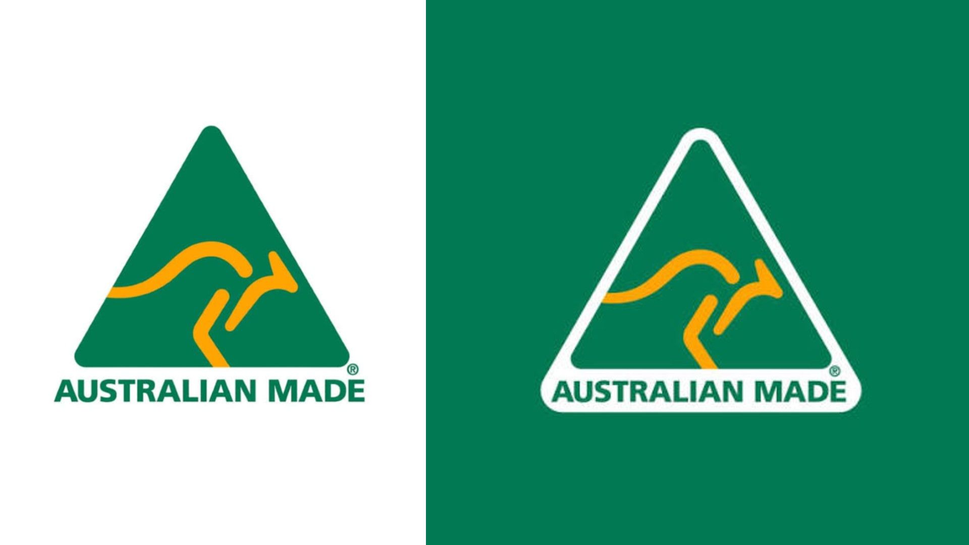
In the design industry, such a short turnaround is often viewed as a recipe for disaster. However, constraints often breed clarity. By eschewing the temptation to over-complicate the design with abstract shapes or complex typography, Cato arrived at a solution that felt inevitable. The green triangle represents the environment and the country’s geography, while the gold kangaroo—a globally recognized symbol of Australia—provides an immediate, visceral connection to the source. It is a design that requires no explanation, no marketing brochure, and no brand-identity manual to decode.
A Chronology of Consistency
To understand the rarity of this longevity, one must look at the landscape of 1980s corporate design. It was a time of excess, bold color palettes, and complex geometries. Yet, the Australian Made logo eschewed these fads.
- 1986: The campaign launches under Bob Hawke. The logo is immediately adopted by manufacturers across the country, serving as a badge of quality and authenticity.
- 1990s-2000s: As the Australian economy shifts, the logo transitions from a government-run initiative to a non-profit organization. Crucially, the design remains untouched, avoiding the "design by committee" trap that ruins so many successful marks.
- 2010s: The digital revolution begins. While many brands "flatten" their logos to suit social media icons and mobile screens, the Australian Made logo is already perfectly suited for this transition due to its clean, high-contrast, geometric structure.
- 2020: The logo survives a "near-death" experience when a controversial, taxpayer-funded "Nation Brand" (a golden wattle design) is unveiled. Public outcry—partly due to the logo’s perceived resemblance to a viral pathogen—reaffirms the public’s deep-seated affection for the original kangaroo mark.
- 2026 and Beyond: Approaching its 40th anniversary, the logo remains the primary visual shorthand for Australian products, proving that consistent branding is the most effective form of long-term marketing.
The Data Behind the Icon
The success of the Australian Made logo is not merely anecdotal; it is backed by empirical data that would make any Fortune 500 marketing executive envious. A recent comprehensive survey revealed that 99% of Australians recognize the logo. Even more impressive is its consumer net trust score of +82.
In the world of market research, a score of +82 is stratospheric. It places the logo in the company of the most trusted non-profit and government institutions in the world. This trust is the "equity" that designers talk about when they argue against unnecessary rebrands. By maintaining the same visual identity, the organization has allowed the logo to accumulate "trust capital" over forty years. Every time a consumer sees the logo on a high-quality product, the psychological association between the mark and the promise of "Australian-made quality" is reinforced.
The "Nation Brand" Controversy: A Case Study in Brand Loyalty
The 2020 incident involving the Australian government’s attempt to introduce a new national brand identity serves as an important lesson in the fragility of public perception. When the "Golden Wattle" logo was released, the public response was swift and largely negative.
Many citizens viewed the new, abstract design as a confusing, expensive, and unnecessary replacement for the trusted kangaroo. The fact that the government had to issue statements clarifying that the new design was not meant to replace the Australian Made logo—but rather to exist alongside it—highlighted a key insight: the public had developed a proprietary sense of ownership over the kangaroo logo. It was no longer just a corporate mark; it was a cultural icon. The backlash wasn’t just about design aesthetics; it was about the perceived abandonment of a trusted symbol of national identity.
Implications for Modern Designers
For the contemporary design professional, the Australian Made logo offers several critical takeaways:
1. The Power of "Obvious"
In a competitive design market, there is a tendency to try to be "clever." Designers often attempt to solve problems with complex visual puzzles. The success of the Australian Made logo proves that if the "obvious" solution is executed with perfect proportion and clarity, it is often the most effective solution.

2. Restraint as a Competitive Advantage
Most brands fall victim to "rebrand fatigue." They change their logos because they feel they must "keep up" with the times. However, the Australian Made logo proves that if you design something that is rooted in the essential identity of the subject—rather than the design trends of the decade—the logo will never feel dated. It remains as relevant today as it was in 1986.
3. The Value of Long-Term Stewardship
The most successful brands are those that are protected and nurtured, not discarded. The stewards of the Australian Made mark understood that their greatest asset was the consistency of the image. By resisting the urge to "modernize" for the sake of modernization, they maintained a level of brand recognition that money simply cannot buy.
Conclusion: A Lesson in Longevity
As we look toward the future of branding, the Australian Made logo serves as a beacon of sanity. In an industry that often confuses change with progress, it stands as a reminder that the best design is often the design that is allowed to grow old.
It did not need to be updated to be digital-friendly; it was already there. It did not need to change to fit a new demographic; it was already universal. It did not need to be "re-imagined" to stay relevant; it remained true to its core purpose.
Ken Cato’s work is a testament to the idea that greatness is rarely found in the complexity of the execution, but in the simplicity of the intent. The kangaroo continues to bound across the green triangle, unbothered by the passing of decades, serving as a permanent, trusted promise of quality. For designers and brand strategists, the message is clear: if you find an answer that is truly right, have the courage to leave it alone.