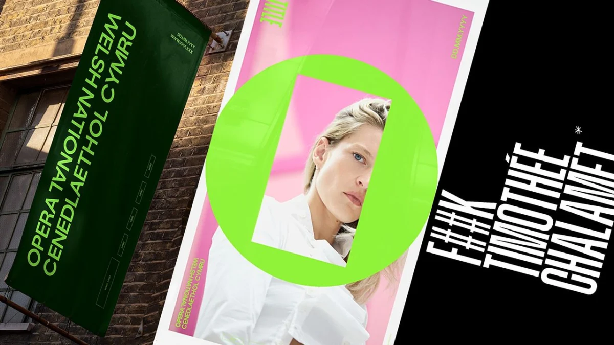
When Timothée Chalamet dismissively suggested earlier this year that "no one cares about opera and ballet anymore," the comment rippled through the cultural sector like a minor tremor. While some might have expected a defensive retreat, the remark instead acted as a catalyst for a renaissance in institutional branding. Far from fading into obscurity, the opera world has responded with a vibrant, defiant assertion of relevance. Leading the charge is the Welsh National Opera (WNO), which, as it approaches its 80th anniversary, has unveiled a radical new visual identity designed to dismantle the dusty stereotypes of the medium and replace them with the raw energy of an electric night out.
The Catalyst: A Hollywood Dismissal
The sentiment expressed by Chalamet was not merely a casual observation; for many in the arts, it represented a pervasive, if misguided, cultural narrative. The perception that classical art forms are relics—static, inaccessible, and disconnected from modern life—has long been the primary hurdle for major cultural institutions.
However, rather than succumbing to this critique, the WNO and its creative partners at the Welsh design studio Bwtic decided to weaponize the controversy. The rebrand was not intended to merely refresh a logo; it was a strategic repositioning of the company as a living, breathing, and fundamentally modern platform for storytelling. By acknowledging the skepticism surrounding the art form, the WNO has effectively transformed an external critique into a narrative of rebirth.
Chronology of a Transformation
The journey toward the new identity began with a deep audit of the WNO’s legacy. As the company prepares for its eight-decade milestone, it needed a look that could bridge the gap between its storied past and a digitally native future.
- Initial Audit: The creative team examined the WNO’s historical visual assets, looking for the DNA of the institution.
- Concept Development: Bwtic identified that the core frustration was the public’s view of opera as a "singular" experience. To combat this, they pivoted toward a modular design language.
- Typographic Research: The team delved into the archives, specifically looking at the typography used for the company’s inaugural production in 1946.
- The Launch: The final reveal occurred this year, just as the discourse regarding the relevance of classical arts reached a fever pitch, positioning the WNO as a proactive, rather than reactive, force in the industry.
The ‘O Frame’: A Masterclass in Minimalist Semiotics
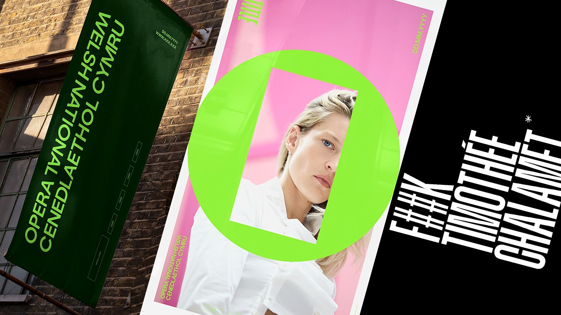
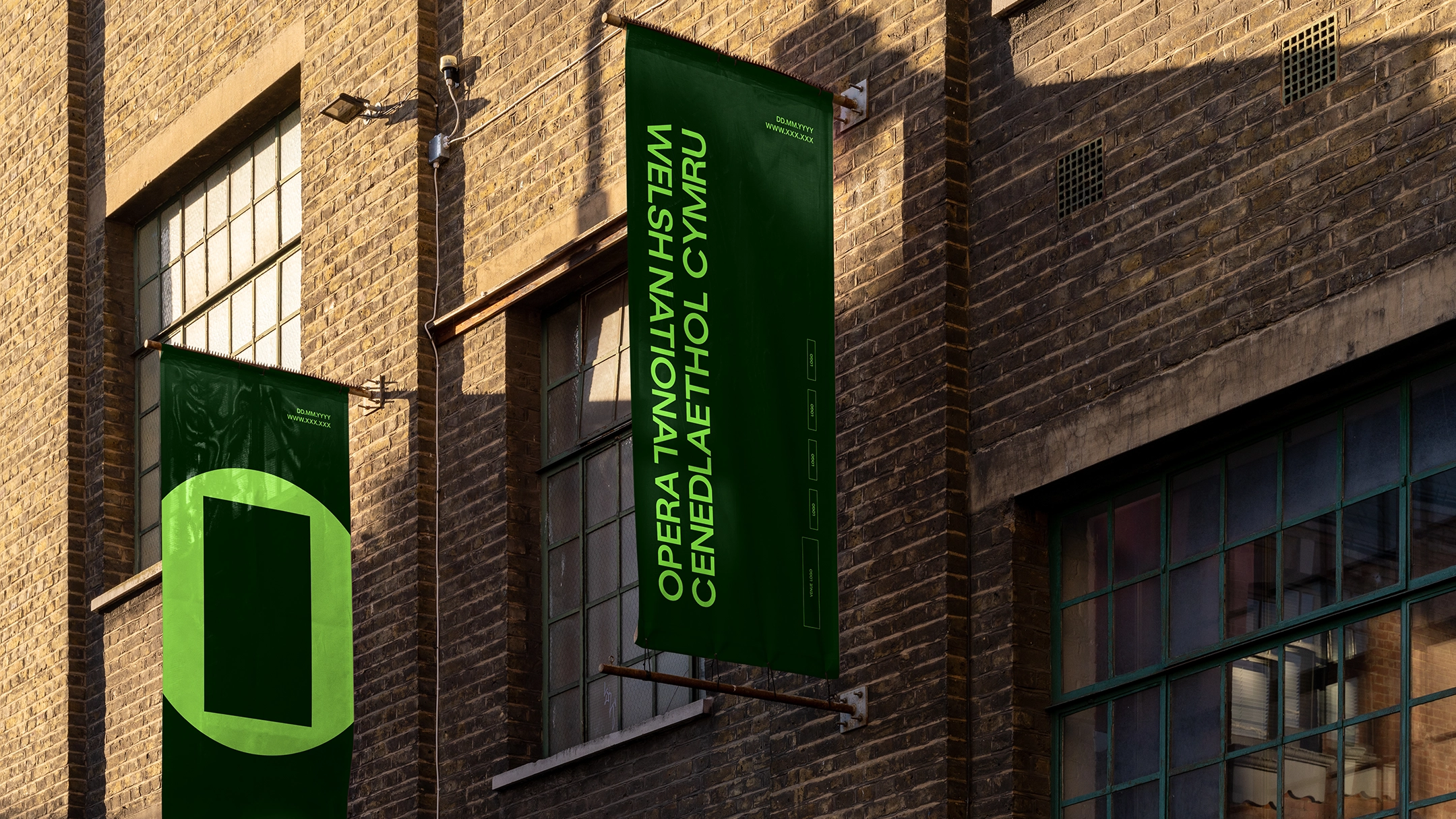
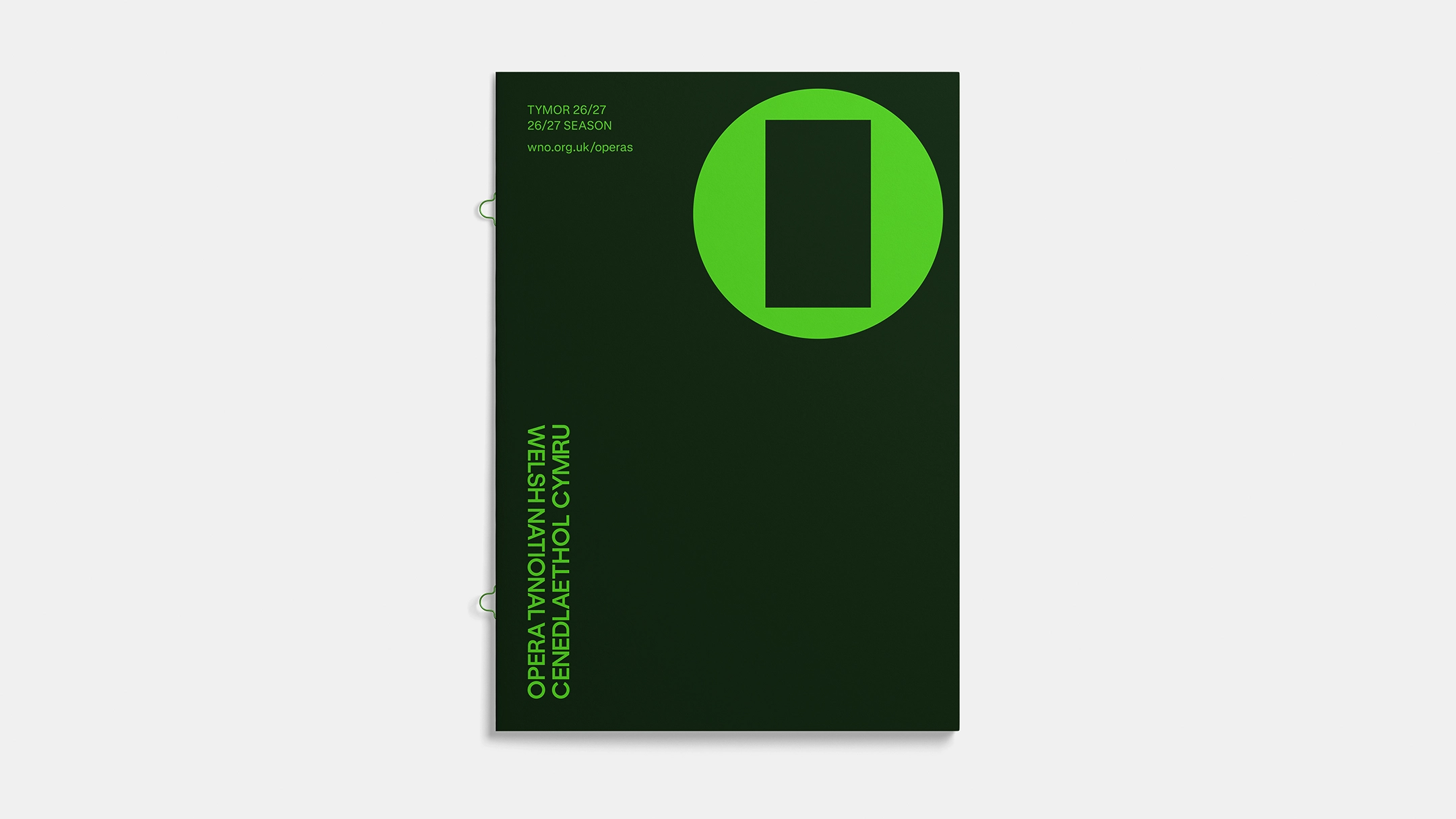
At the heart of the new identity is a device the studio calls the ‘O Frame.’ It is a deceptively simple, minimalist mark: a circular ‘O’ containing an open, floating rectangle. This is not merely an aesthetic choice; it is a profound philosophical statement.
Bwtic explains that the design was born from the realization that opera is too often siloed into one particular story told in one particular way. The circle represents the medium itself—the tradition, the grand scale, and the history of opera. The inner rectangle represents the individual production—the specific story, the unique emotional arc, and the point of view of the creators.
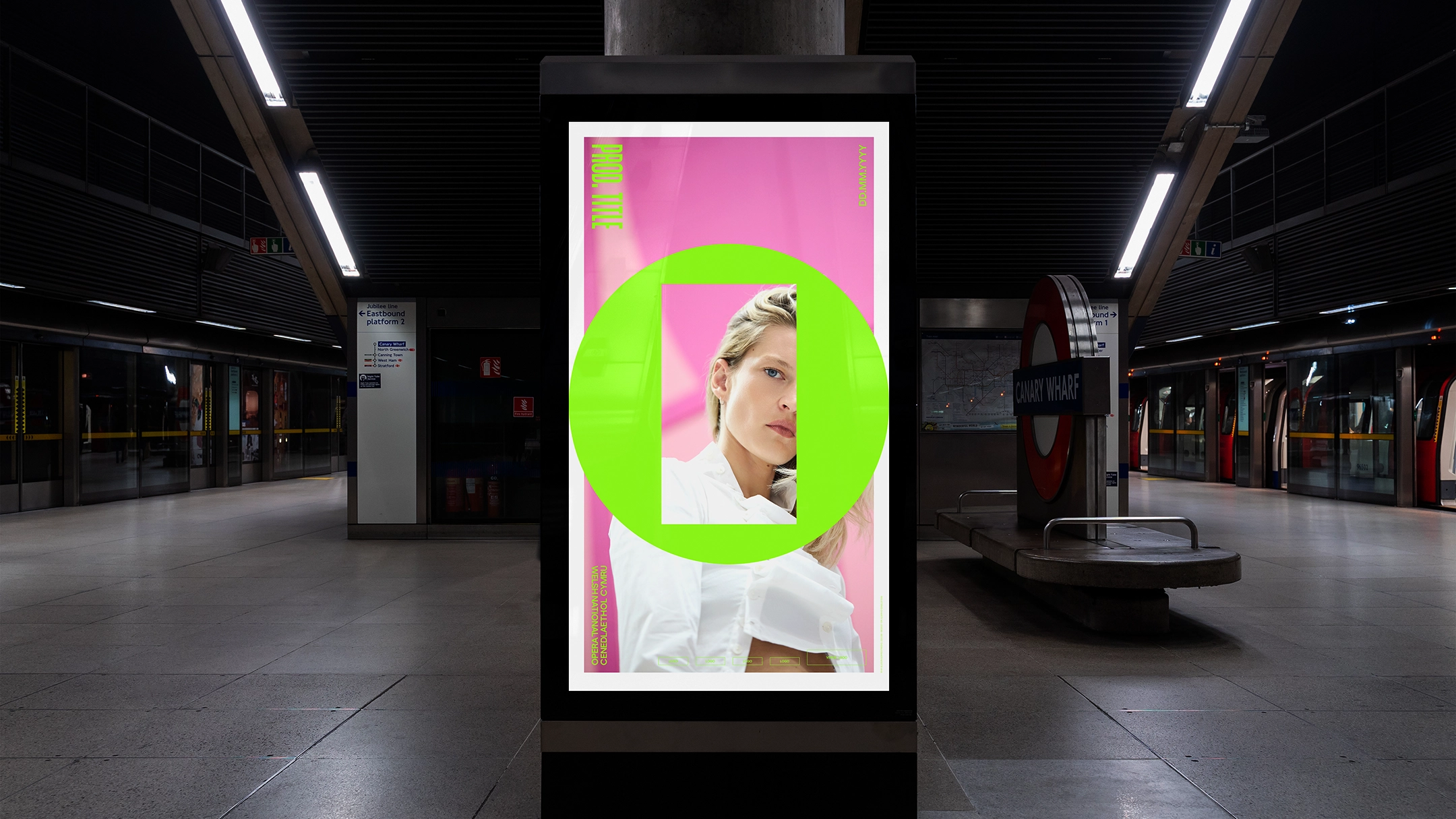
The "dissonance" between the square and the circle is entirely intentional. By forcing these two geometric forms together, the branding acknowledges the tension between tradition and innovation. It is an admission that opera is not just a "round" museum piece, but a "square" peg that refuses to fit into the conventional holes of modern entertainment.
Navigating the Bilingual Landscape
Wales occupies a unique space in the cultural landscape, and the WNO’s branding reflects a sophisticated approach to bilingualism. For many Welsh organizations, the challenge of presenting English and Welsh with equal weight has often led to clunky, side-by-side layouts that feel forced.
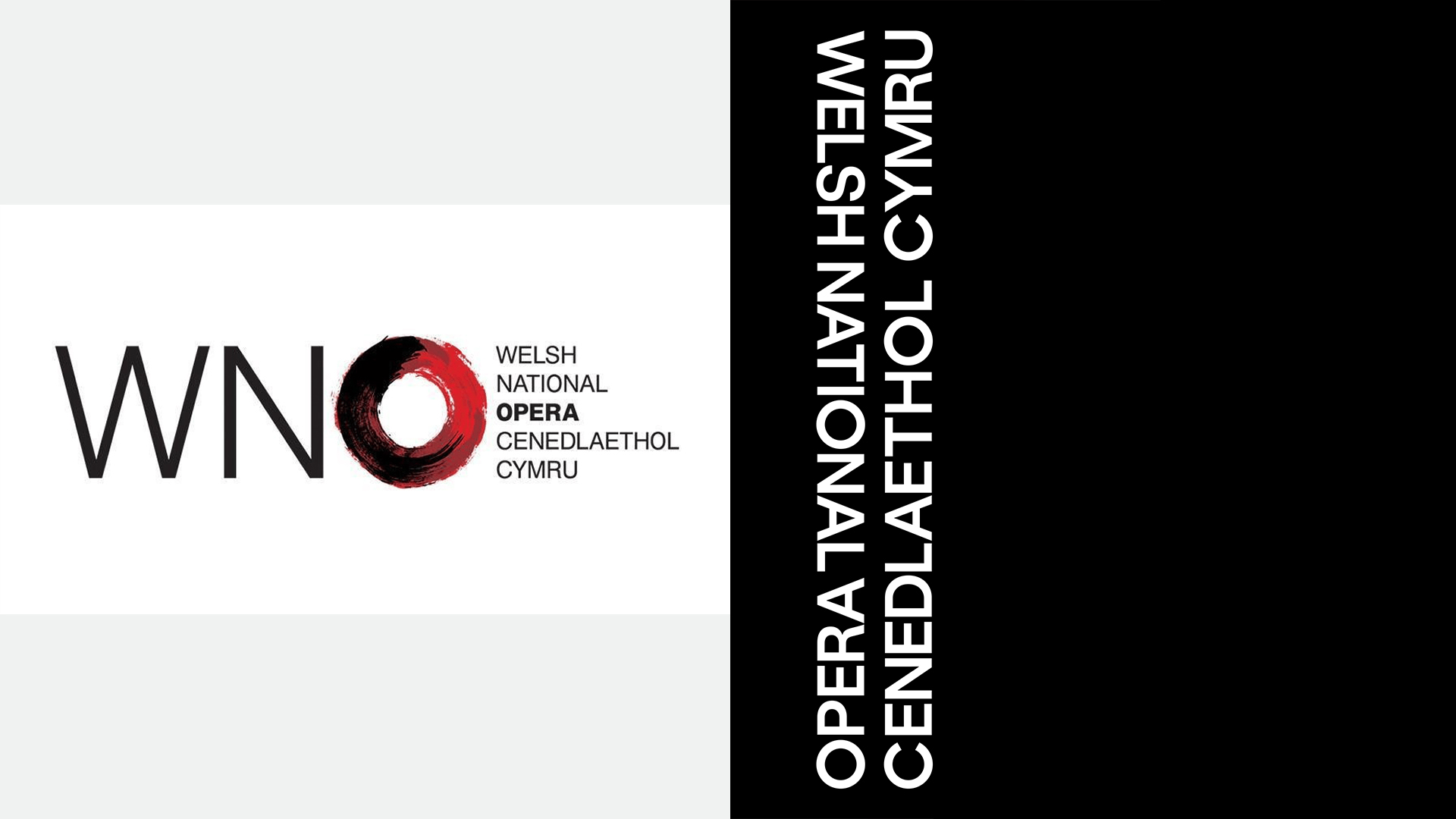
The new WNO logotype avoids this by relying on the user’s own intuition. The typography is designed so that, regardless of whether a reader is a native Welsh or English speaker, their eye naturally gravitates toward their language first. This is a subtle but powerful shift in cultural authority. It moves away from the "English-first, Welsh-second" hierarchy that has plagued so many regional branding efforts, favoring instead a balanced, fluid approach that mirrors the way opera itself interweaves diverse languages and emotional textures.
Typographic Authority: Bridging 1946 to Today
Typography is often the quiet workhorse of branding, yet in the WNO’s case, it serves as the bridge across eighty years of history. Bwtic’s design system is heavily inspired by the GT Standard typeface, a condensed, upper-case sans-serif that was used to promote the company’s very first production in 1946.
By reviving the spirit of this typeface, the studio has created a visual continuity that honors the founders of the WNO while pushing the aesthetic into a contemporary, digital-first space. The font is bold, authoritative, and direct. It possesses a "no-nonsense" quality that effectively silences the notion that opera is soft or sentimental. It is, quite literally, a font that can carry the weight of a traditional art form while still looking sharp on a smartphone screen or a high-impact digital billboard.
Supporting Data: Why Modernity Matters
The move toward this new identity is backed by the urgent need for digital engagement. As the arts sector continues to struggle with post-pandemic attendance, the "brand experience" has become as important as the performance itself.
Industry data consistently shows that younger demographics—the very people Chalamet was speaking to—prioritize "experience-led" brands. They are not looking for passive consumption; they are looking for something that feels like an event. By adopting a brand identity that leans into "dissonance" and "energy," the WNO is signaling that it is not a heritage site, but an active participant in the cultural conversation.
Official Responses and Strategic Implications
The design community has largely lauded the rebrand as a masterclass in institutional pivot. By engaging with the "Chalamet controversy," the WNO has effectively hijacked the narrative, using it to frame themselves as the bold alternative to the Hollywood status quo.
The strategic implications of this are significant:
- Cultural Authority: By asserting their identity so strongly, the WNO has re-established itself as a leader in the arts, rather than a struggling follower.
- Versatility: The O Frame is inherently modular, meaning the WNO can adapt it for social media campaigns, immersive digital art, and traditional print media without losing its core identity.
- Intellectual Rigor: The focus on the "square peg, round hole" concept provides a deeper intellectual layer that resonates with the opera’s core audience while inviting newcomers to look closer at what the company stands for.
Conclusion: An Electric Future
The Welsh National Opera’s decision to embrace a contemporary, provocative identity is a testament to the fact that tradition and innovation are not mutually exclusive. By acknowledging the skepticism of the modern age and turning it into an opportunity for creative expression, the WNO has proven that opera is not just surviving—it is evolving.
As the company enters its 80th year, the ‘O Frame’ will serve as a constant reminder that while the circle of opera is wide and deep, it is the stories within the frame that truly matter. Whether or not Timothée Chalamet "cares" about the medium is ultimately irrelevant. The WNO is no longer seeking permission to exist; it is commanding attention on its own terms, proving that the most enduring art forms are the ones that have the courage to change.
In a world of fleeting trends and algorithmic content, the WNO’s move is a reminder that design, when rooted in a strong institutional philosophy, can be a powerful tool for cultural preservation. The opera is not dead; it has simply updated its stage.