
In the high-stakes world of corporate identity, few things are as meticulously guarded as the visual language of a global icon. When Coca-Cola announced its latest brand identity overhaul, executed by the agency JKR, the objective was clear: to refresh the company’s aesthetic, streamline its typography, and lean into a more heritage-focused, premium look. However, the rollout has been met with an unforeseen wave of skepticism, as eagle-eyed social media users and design enthusiasts have pointed out an uncanny, and perhaps unfortunate, resemblance between Coca-Cola’s new custom typeface and the iconic branding of Marlboro cigarettes.
The Evolution of the Brand Identity
The centerpiece of Coca-Cola’s design pivot is the "Better With" typeface, a custom font family commissioned by the soft drink giant and developed by the renowned Brody Associates. The collaboration, which began in 2023, was originally intended to serve as a festive, limited-run typography for holiday-themed marketing materials. Its success in those early applications, however, convinced Coca-Cola executives to adopt it as a cornerstone of their permanent brand architecture.
According to Brody Associates, the creative brief was to synthesize the company’s extensive serif font heritage with the demands of a modern, digital-first consumer landscape. The designers sought to evoke "movement, playfulness, and a unique personality" that would feel both timeless and contemporary. By digging into the company’s deep archives, the design team aimed to tell a story of longevity, grounding the brand in the visual history of the 20th century.
A Chronology of the Rebrand and Public Reaction
The path to this visual controversy can be traced through several key milestones:
- 2023: Coca-Cola commissions Brody Associates to develop "Better With," a bespoke serif typeface designed specifically for the winter holiday season.
- Early 2026: Following a successful pilot program, Coca-Cola begins the process of integrating "Better With" into its broader, permanent brand identity, intending to unify its global messaging.
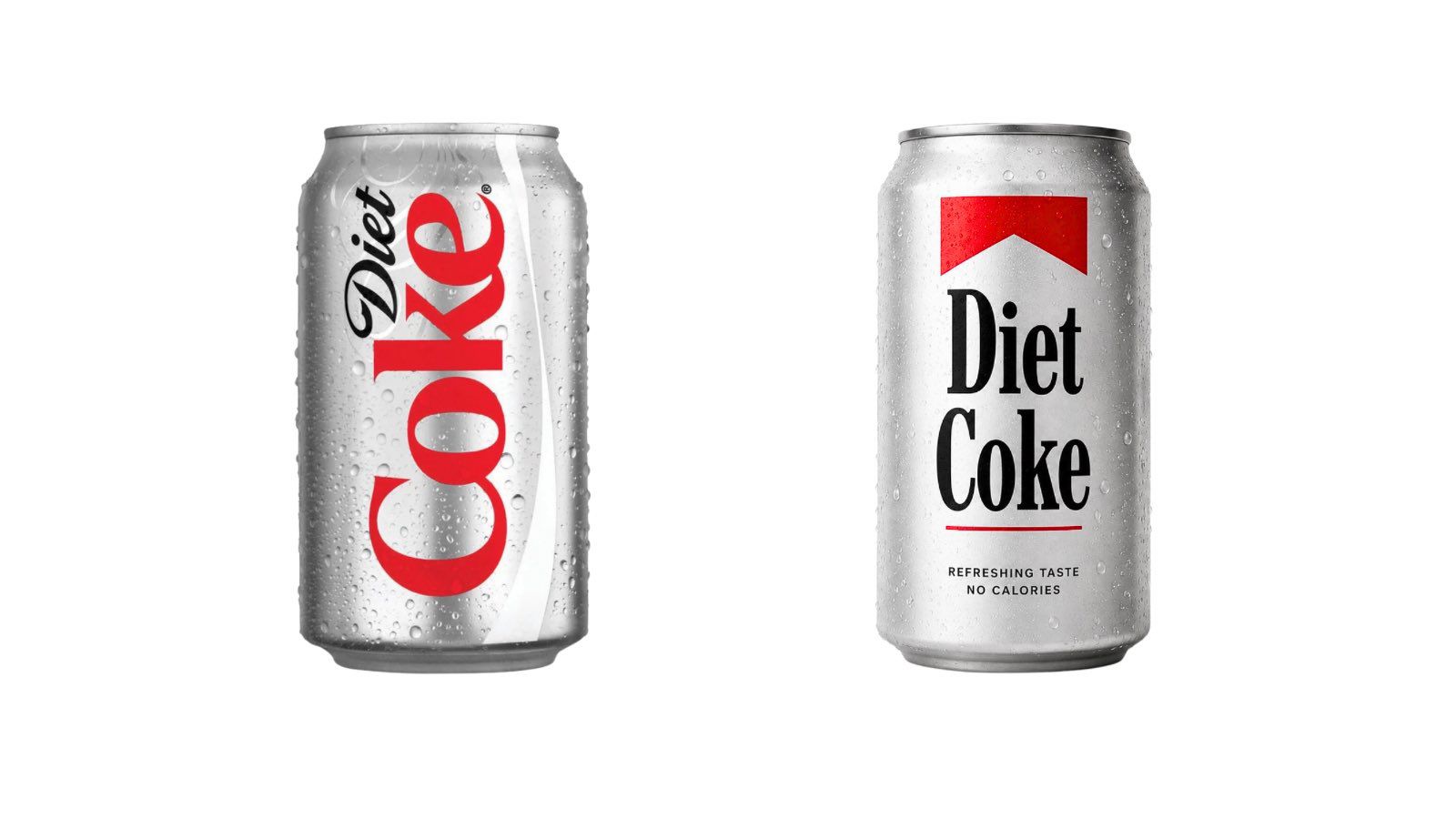
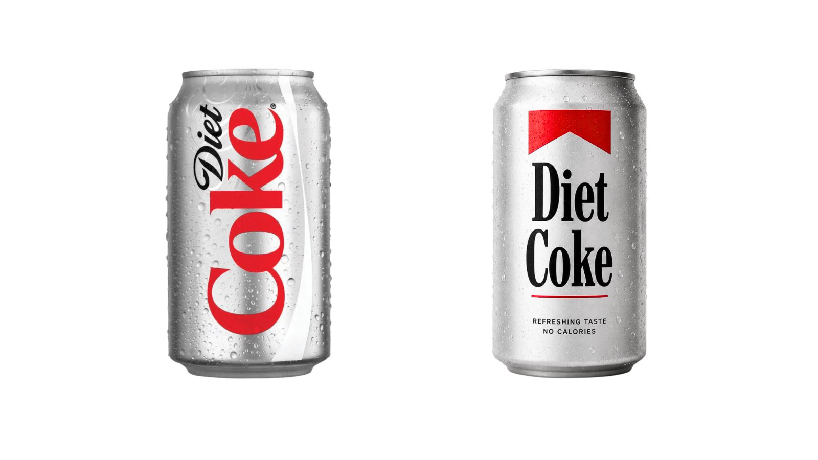
- July 20, 2026: The official launch of the updated branding hits global markets. Within hours, users on platforms like X (formerly Twitter) begin circulating side-by-side comparisons of the new Coca-Cola packaging and vintage Marlboro cigarette packs.
- Late July 2026: The meme "Diet Coke is a fridge cigarette" goes viral, cementing the public perception that the soft drink has moved from being a casual refreshment to a lifestyle habit—a parallel that the new branding seems to have inadvertently encouraged.
The Psychology of Visual Cues
The discomfort surrounding this rebrand is not purely a matter of coincidence; it touches on the principles of semiotics—the study of signs and symbols. Both Coca-Cola and Marlboro have historically relied on a high-contrast palette of "coca-red" and white. When you pair this established color scheme with a serif typeface that carries a mid-century, Americana aesthetic, the brain naturally bridges the gap between the two entities.
While the fonts themselves are not identical—"Better With" is a distinct, proprietary design—it occupies the same "visual neighborhood" as the typography associated with the tobacco industry. This is a space characterized by bold, authoritative lettering that feels both established and slightly retro. For a brand like Coca-Cola, which is currently navigating a complex global landscape involving anti-sugar activism and public health scrutiny, the association with a legacy industry like tobacco is a public relations hurdle they likely did not anticipate.
Supporting Data: The "Fridge Cigarette" Phenomenon
The internet’s reaction to the rebrand has been characterized by a blend of irony and sharp cultural analysis. Social media users have been quick to point out that the rebranding feels "self-aware." The phrase "fridge cigarette"—a term used to describe the ritualistic consumption of a chilled Diet Coke as a stress-reliever or a midday vice—has been trending across TikTok and X.
This cultural shift is backed by an emerging demographic trend: for many younger consumers, the consumption of high-caffeine, zero-sugar soda has become a ritualistic substitute for traditional stimulants. By adopting a typeface that mirrors the classic, "tough" aesthetics of tobacco branding, Coca-Cola has inadvertently tapped into a subculture that views the beverage as a habit-forming staple rather than a simple treat.
Official Responses and Creative Intent
To date, Coca-Cola has remained largely silent regarding the specific comparisons to Marlboro. Their messaging remains focused on the "Better With" font’s roots in the brand’s own archival material. In a statement, Brody Associates emphasized that the design was a tribute to "the company’s rich serif font heritage."
Industry experts suggest that Coca-Cola’s design team likely prioritized a "heritage aesthetic" to combat the perceived "cheapness" of modern, minimalist branding. In a world of sans-serif, tech-centric logos, returning to a classic, high-contrast serif typeface is a strategic move to signal quality and tradition. The unintended resemblance to cigarette branding is, in all likelihood, an unfortunate byproduct of choosing a typeface that shares the same historical lineage of 20th-century American advertising.
Implications for Global Branding
The controversy raises a pertinent question: Can a brand ever truly "own" an aesthetic that is deeply embedded in the cultural subconscious?
The Burden of History
Coca-Cola is a brand that literally built the visual language of modern advertising. When it reaches into its archives to find inspiration, it is effectively reaching into the same cultural well that defined the visual identity of mid-century tobacco, alcohol, and automotive companies. The "Marlboro look" is not just a cigarette brand; it is a shorthand for American industrial confidence.
The Public Health Lens
The irony of the situation is amplified by the current regulatory environment. With the UK, parts of Europe, and several US states implementing "sugar taxes" and stricter labeling requirements for sugary beverages, Coca-Cola is under more scrutiny than ever. Association with the tobacco industry—a sector that has been decimated by regulation and public health campaigns—is the last thing the company wants. The visual similarity, however superficial, provides a perfect hook for critics who argue that ultra-processed, sugary drinks deserve the same regulatory treatment as addictive substances.
The Future of "Better With"
Despite the online chatter, it is unlikely that Coca-Cola will abandon the "Better With" typeface. Global corporations rarely walk back branding decisions made after years of development and millions of dollars in investment. Instead, the company will likely lean into the "heritage" narrative, hoping that the public will eventually separate the typeface from its unfortunate aesthetic cousins.
Conclusion: Lessons in Modern Branding
The case of Coca-Cola’s new typeface serves as a cautionary tale for designers and brand managers alike. In an era of instant global feedback, a brand’s visual history is never isolated. Every font choice, color palette, and layout is subject to the collective memory of the internet.
What the designers at JKR and Brody Associates perhaps underestimated was the speed with which the modern consumer can map a new design onto an existing cultural archetype. For Coca-Cola, the goal was to evoke the nostalgia of the 1950s and 60s. Instead, they hit a nerve that connects their product to the most contentious branding of the 20th century. While the "Better With" typeface is undeniably beautiful and fits the brand’s stated goals, it also serves as a reminder that in the world of high-level branding, you aren’t just designing a look—you are stepping into a conversation that started decades ago. Whether this branding will be viewed as a mistake or a bold, unintentional masterstroke of cultural relevance remains to be seen. For now, the "fridge cigarette" meme continues to thrive, and Coca-Cola finds itself in the strange position of being the most "self-aware" soft drink brand in history.