
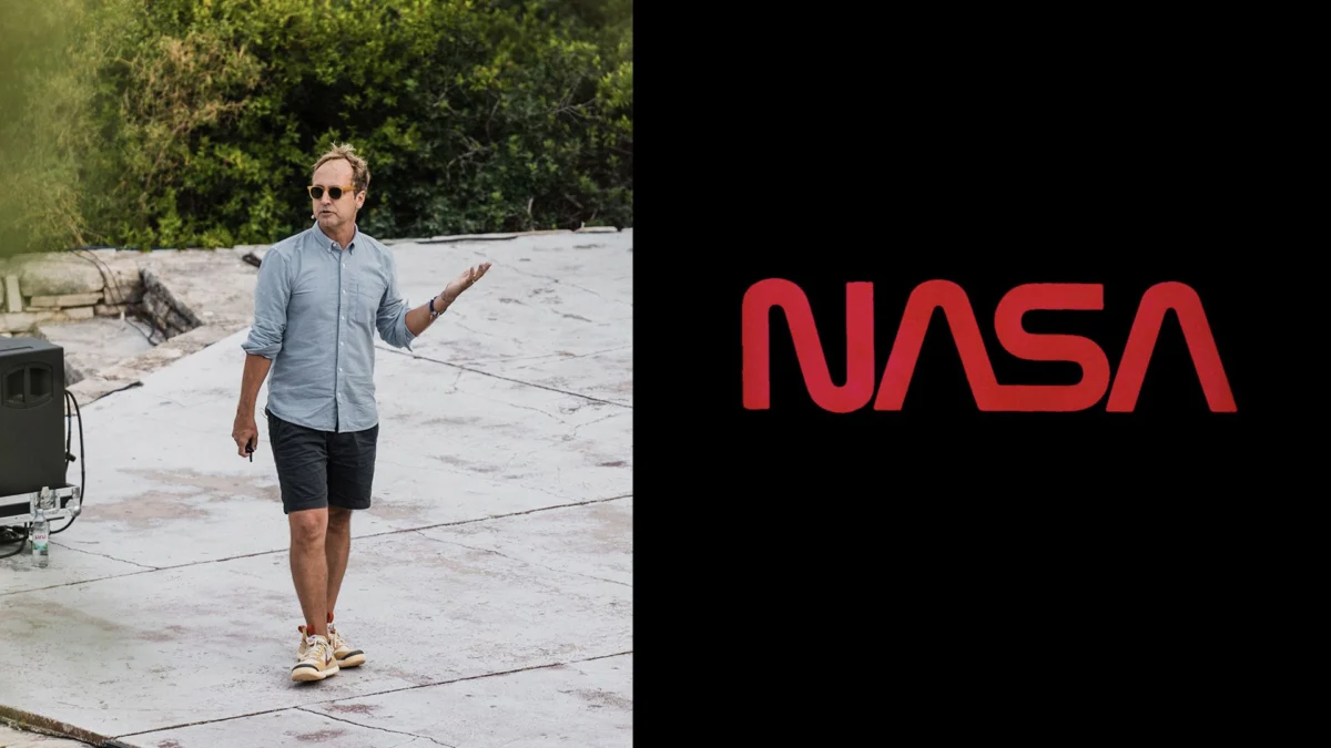
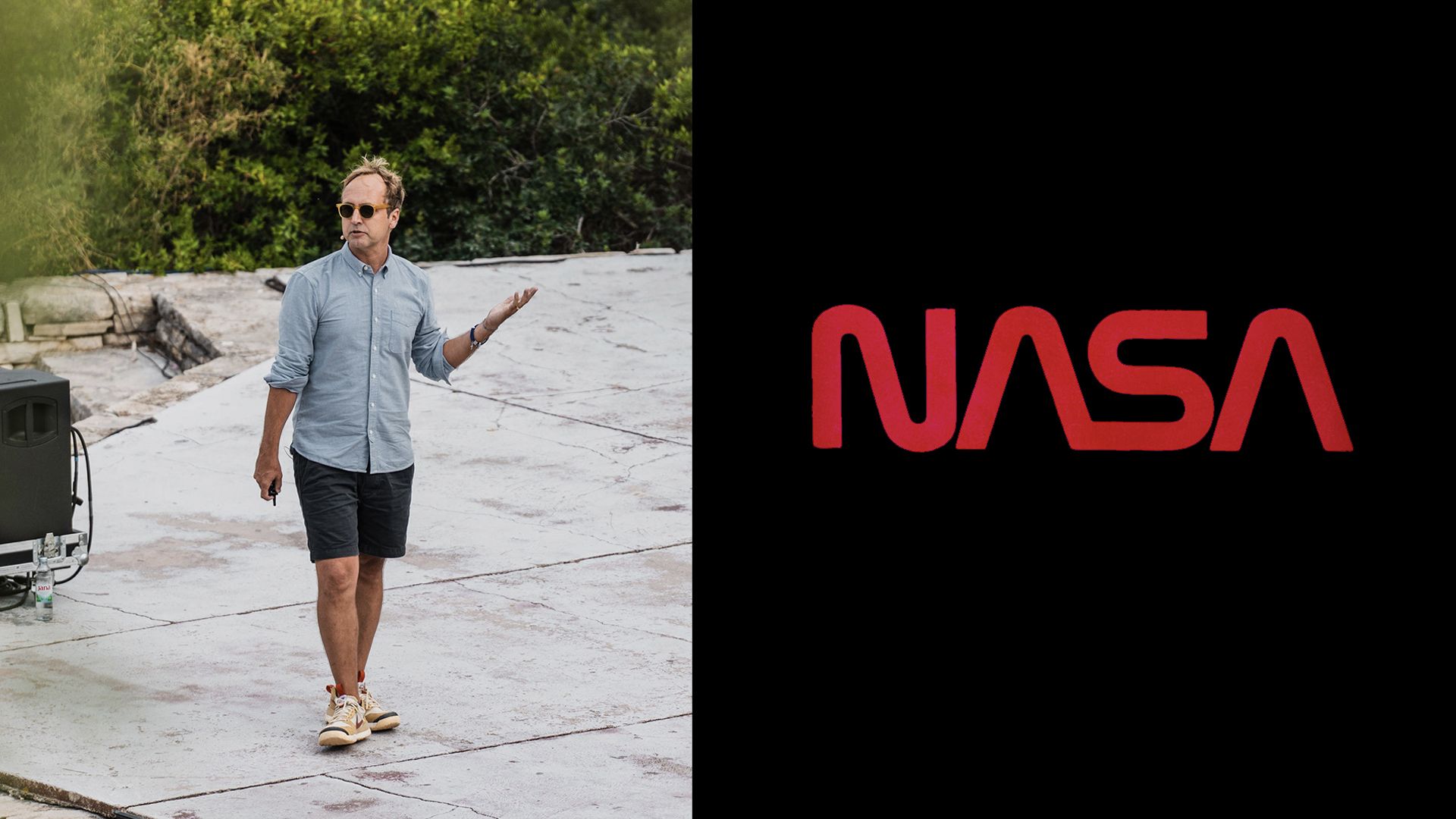
Last week, on the serene, sun-drenched shores of Obanjan Island, Croatia, the global design community gathered for Frontify’s Paradigms 2026 conference. Amidst a high-profile lineup of creative directors from top-tier design studios and international tech giants, one presentation stood out for its unique challenge: managing the visual identity of a federal agency that carries the weight of human history on its shoulders.
David Rager, the Creative Director at NASA, took the stage to offer a rare, behind-the-scenes look at how the agency preserves its visual legacy—most notably the revival of the iconic "worm" logo—while navigating the turbulent, AI-driven landscape of the 21st century.
The Architect of an Iconic Brand
For many, NASA is more than just a federal agency; it is a symbol of human potential, discovery, and the relentless pursuit of the unknown. As Creative Director, Rager’s role is to ensure that this vast, complex organization speaks with a unified voice.
"It’s not a very straight line," Rager admitted during our follow-up interview, reflecting on a career path that began in the underground music scene. His early days were defined by the DIY ethos of creating gig posters, flyers, and album covers for local bands. This grassroots experience eventually propelled him into the museum world, agency-led creative projects, and even a stint at Disney.
His journey to NASA was equally organic. Having lived in a neighborhood directly adjacent to NASA’s Jet Propulsion Laboratory (JPL) in Los Angeles, Rager became fascinated by the agency’s internal creative machinery. Recognizing a need for cohesive design leadership during an agency-wide reorganization, NASA brought Rager on board in 2019. By 2023, his influence had expanded from JPL to the agency’s headquarters in Washington, D.C., where he now oversees the monumental task of safeguarding NASA’s visual brand.
A Chronology of the ‘Worm’ and the ‘Meatball’
The history of NASA’s branding is a tale of two logos: the "Meatball" and the "Worm."
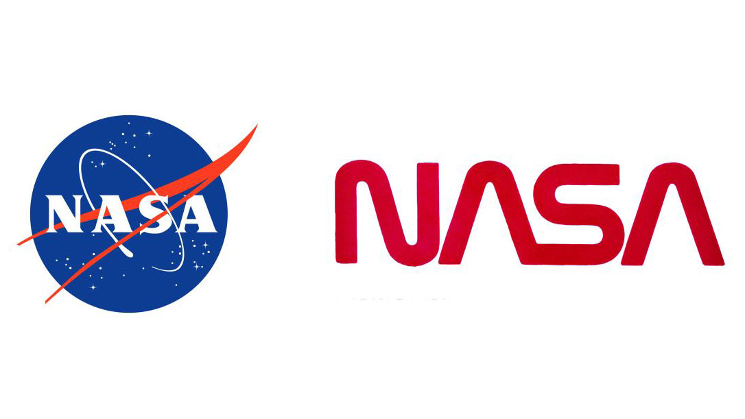
The "Meatball"—the agency’s official blue insignia—was introduced in 1959. It is rich in symbolism, representing the aeronautics, research, and space exploration missions of the organization. However, by the 1970s, the agency felt the need for a more modern, streamlined identity. Enter the "Worm," a sleek, minimalist logotype introduced in 1975 under the Federal Design Improvement Program.
"In 1992, we had an administrator who came in and didn’t like it," Rager explained. Seeking to recapture the specific spirit and pride of the Apollo era, the administration at the time retired the Worm in favor of the traditional Meatball. For nearly three decades, the Worm was relegated to the archives, becoming a cult favorite among design enthusiasts and space nerds alike.
The 2020 resurrection of the Worm was a landmark moment in graphic design history. It wasn’t merely a nostalgic choice; it was a strategic move to re-energize the agency’s visual presence. The impact was immediate and profound, culminating in the logo’s acquisition by the Museum of Modern Art (MoMA) in New York for its permanent collection—a testament to its status as a masterpiece of American graphic design.
Bridging the Gap: Design as Internal Education
Managing a brand with such immense cultural capital is an exercise in diplomacy. Rager notes that, unlike a private corporation, NASA is a house of scientists and engineers, many of whom have spent their entire professional lives within the agency.
"If you’ve been there a long time, it’s easy to think of the brand as wallpaper," Rager says. "You don’t even notice it."
His strategy has been to facilitate workshops and presentations that demonstrate how consistent branding isn’t just about aesthetics—it’s about clarity and value. By educating internal teams on the significance of their visual identity, Rager has successfully fostered a culture where even the most technical departments understand that their communication has a ripple effect on public perception. The goal is to move the agency away from seeing design as an afterthought and toward embracing it as a core component of their scientific mission.
The Philosophical Core: Selling Optimism
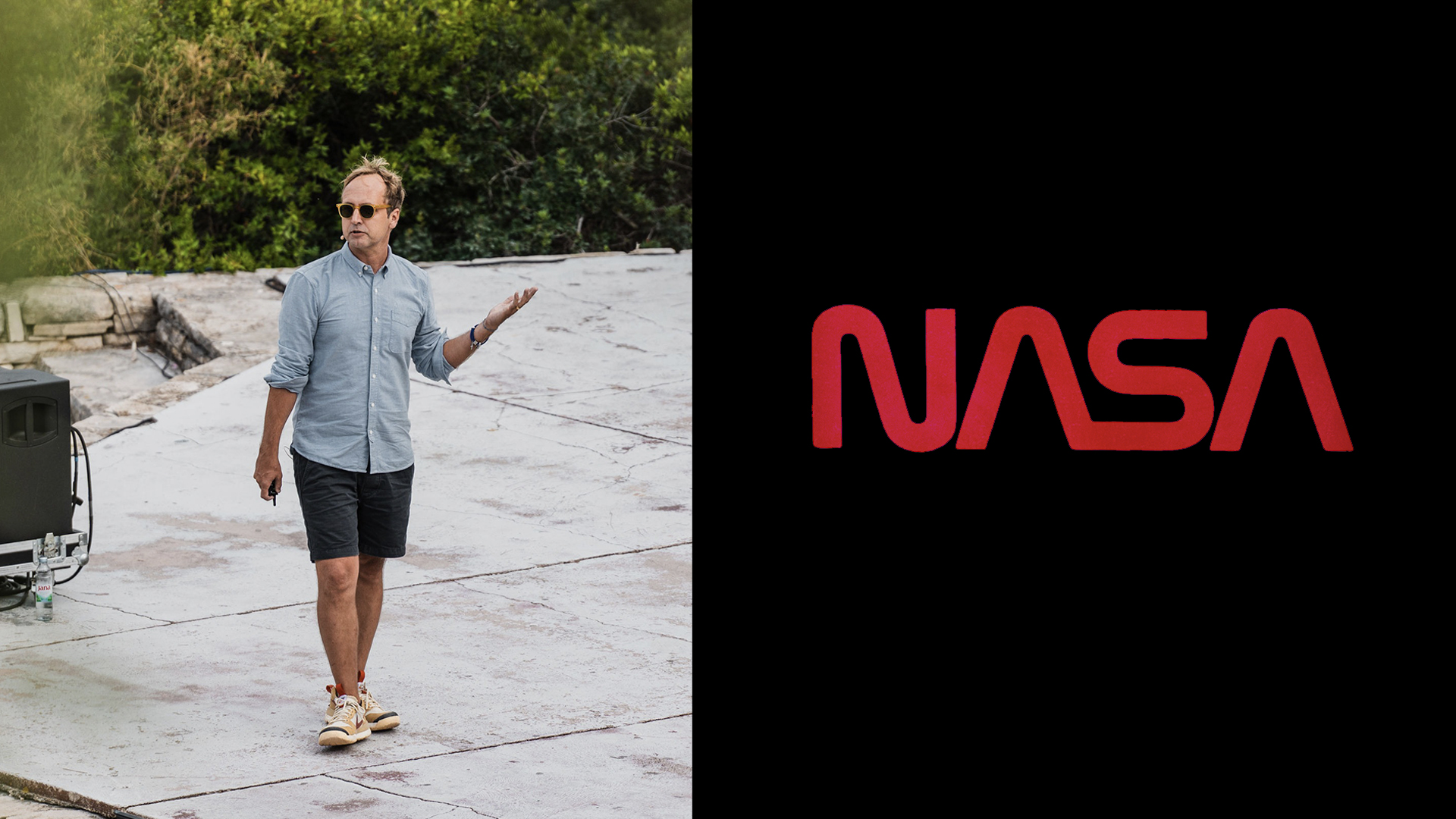
When asked what values NASA’s brand truly represents, Rager shifts from the technical to the existential. "We’re not selling a product," he explains. "What we are selling is optimism and humanity."
This "for all humankind" philosophy is what sets NASA apart from any other entity. Because the agency is funded by the public, every visual touchpoint—from mission patches to social media graphics—must convey that the taxpayer’s investment is yielding something of profound significance. The brand must bridge the gap between complex orbital mechanics and the universal human desire to reach for the stars.
The AI Dilemma: Trust as the Ultimate Currency
Perhaps the most pressing challenge Rager faces in the modern era is the rise of generative AI. In an age where deepfakes and AI-generated imagery can blur the line between reality and fabrication, NASA’s brand is uniquely vulnerable.
Rager has taken a firm, uncompromising stance: He has prohibited the use of AI imagery for official NASA branding.
"Our brand is built on trust," Rager asserts. "When people look at an image from NASA, they need to understand that it’s real, that they can believe what they see."
This decision was met with pushback from some internal teams eager to leverage new technical tools for efficiency. However, Rager’s reasoning is rooted in the agency’s broader mission. "There are already enough people out there who are looking for excuses not to believe something is true, and we don’t need to fuel the fire."
He argues that NASA already possesses the world’s most incredible visual library—photographs of distant galaxies, landing sites on Mars, and the ethereal beauty of Earth from space. These authentic assets are the antidote to the artificiality of current AI models. "We have the kind of stuff that AI wishes it could make," he says. By prioritizing authentic imagery over generated content, NASA reinforces its position as the ultimate arbiter of truth in scientific exploration.
Implications for the Future of Public Branding
The lessons from Rager’s tenure at NASA extend far beyond the aerospace industry. In a digital landscape saturated with synthetic media, the responsibility of legacy brands to act as "truth-tellers" has never been greater.
NASA’s commitment to its visual standards—and its willingness to restrict the use of cutting-edge technology when it compromises brand integrity—serves as a case study for other public institutions. As we move further into the decade, the ability to maintain a consistent, trustworthy, and human-centric identity will be the deciding factor in how organizations connect with the public.
For now, the Worm continues to fly alongside the Meatball, a dual identity that represents both the agency’s storied past and its ambitious future. Under Rager’s guidance, NASA isn’t just sending spacecraft to the far reaches of the solar system; it is ensuring that the visual language of that journey remains as clear, bold, and reliable as the science itself.