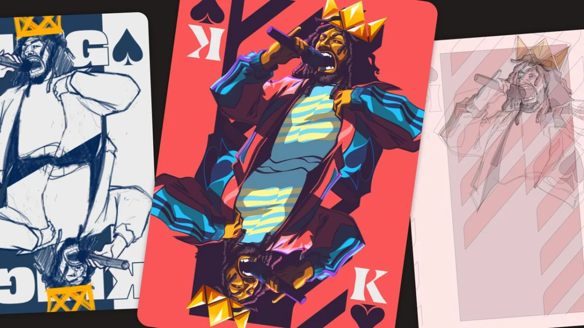
Designing a deck of playing cards is one of the most deceptive challenges in the graphic design world. On the surface, the requirements appear straightforward: a standardized set of shapes, symbols, and rules that have remained largely unchanged for centuries. However, the constraints are severe. A card must be instantly recognizable when held, fanned, or thrown across a table; it must be readable both right-side up and upside down; and it must convey a cohesive narrative within a surface area barely larger than the palm of a hand.
For New York-based illustrator Pope Phoenix, this challenge served as the perfect canvas to explore the history, energy, and visual language of hip-hop. Commissioned by Affinity to design a deck that could theoretically transition into a physical product, Phoenix’s "King of Spades" project is more than just a deck of cards—it is a study in cultural synthesis, blending Afrofuturism, expressive character design, and the raw, gritty textures of street art.
The Pillars of the Deck: A Concept Born of Culture
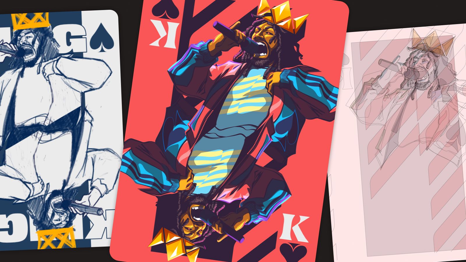
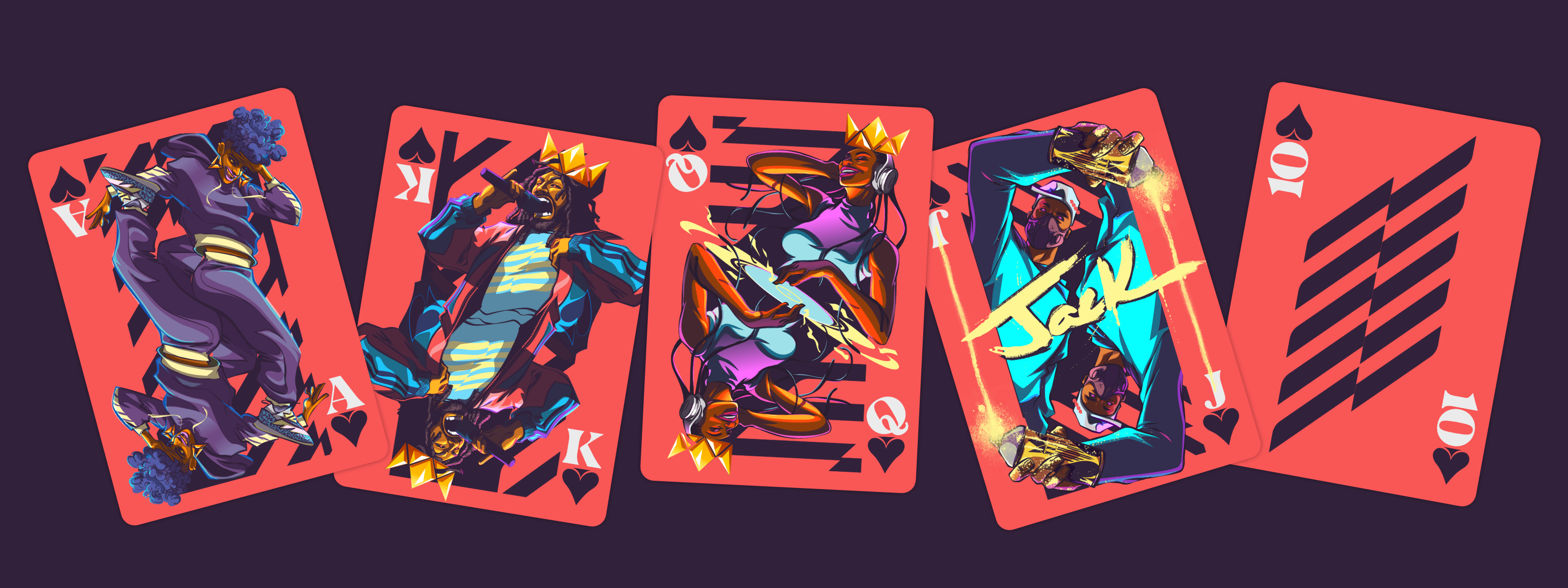
The "King of Spades" project was built on an open brief: design a playing card deck that honors the legacy of hip-hop. Phoenix, known for his emotionally driven portraits and editorial work for clients like IBM and BET, chose to anchor the project in the four fundamental pillars of hip-hop culture: MCing, DJing, Breaking (B-boying), and Graffiti.
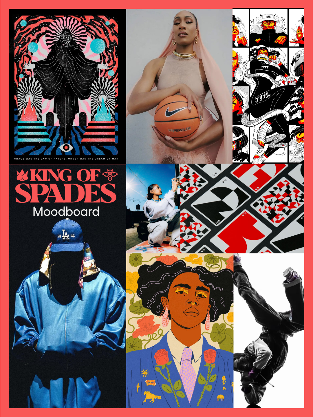
"I narrowed the themes down to Afrofuturism, hip-hop culture, and a Wakanda-inspired royal family," Phoenix explains. By focusing on the face cards, he found the ideal opportunity to weave these pillars into a traditional royal flush. Each card serves as a visual ambassador for its respective pillar, with the 10-card acting as a bridge between the regal face cards and the structural requirements of the deck.
Chronology of Creation: From Sketchbook to Digital Precision
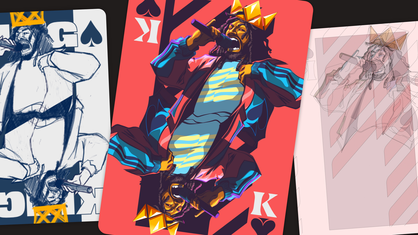
The journey of the deck began with rigorous research. Before opening Affinity Designer, Phoenix immersed himself in the history of card design, analyzing how traditional decks achieve balance and utility.
Phase 1: Ideation and Thumbnails
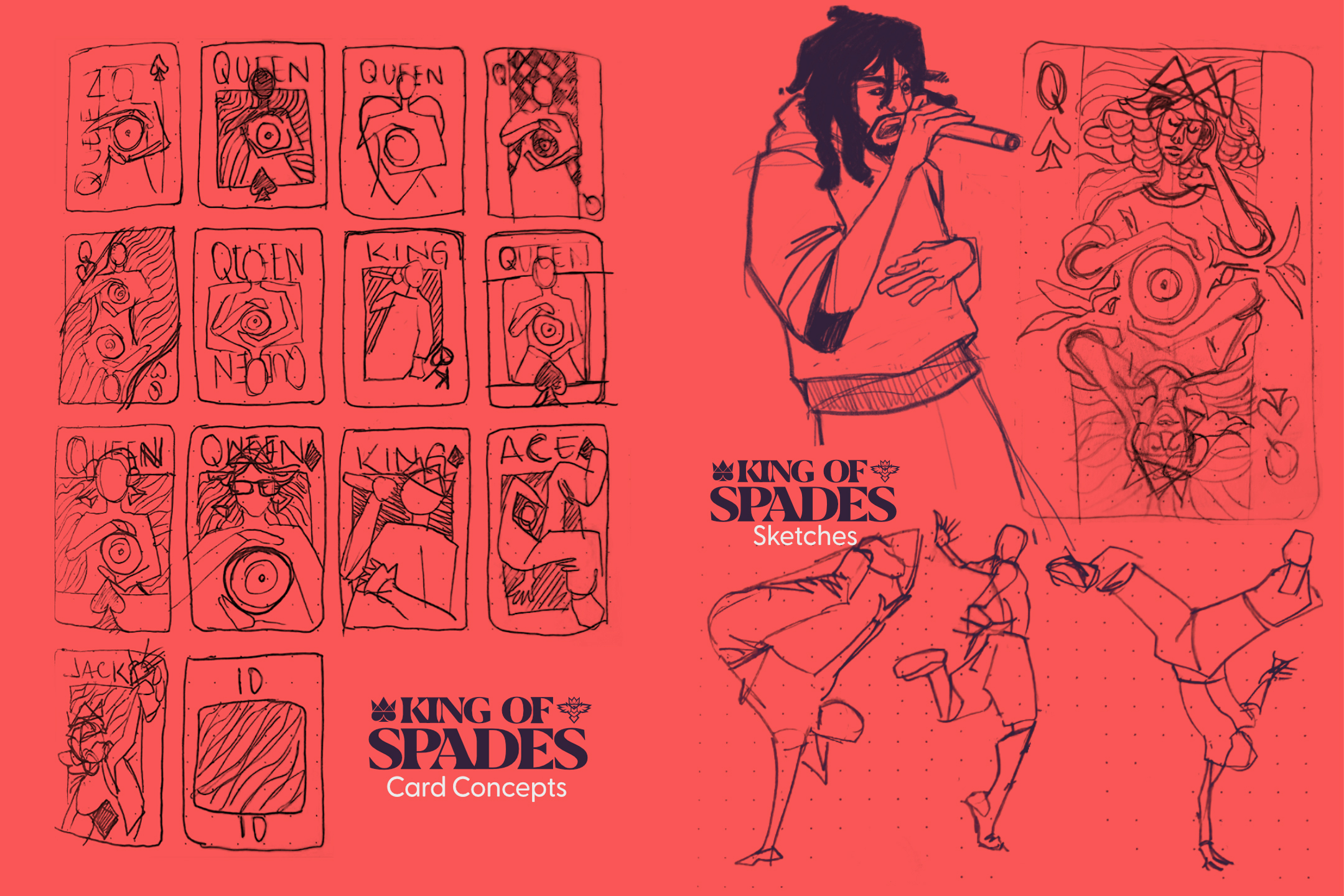
The initial phase involved translating abstract cultural concepts into tangible visual systems. Phoenix experimented with several directions before settling on the "Royal Flush" motif. He credits the traditional playing card structure as the "safety net" that allowed him to push his creative boundaries. "The mirrored face card structure was essential," he notes. "It ensured the cards remained readable no matter how they were handled, which was a non-negotiable constraint."
Phase 2: Vectorizing the Vision
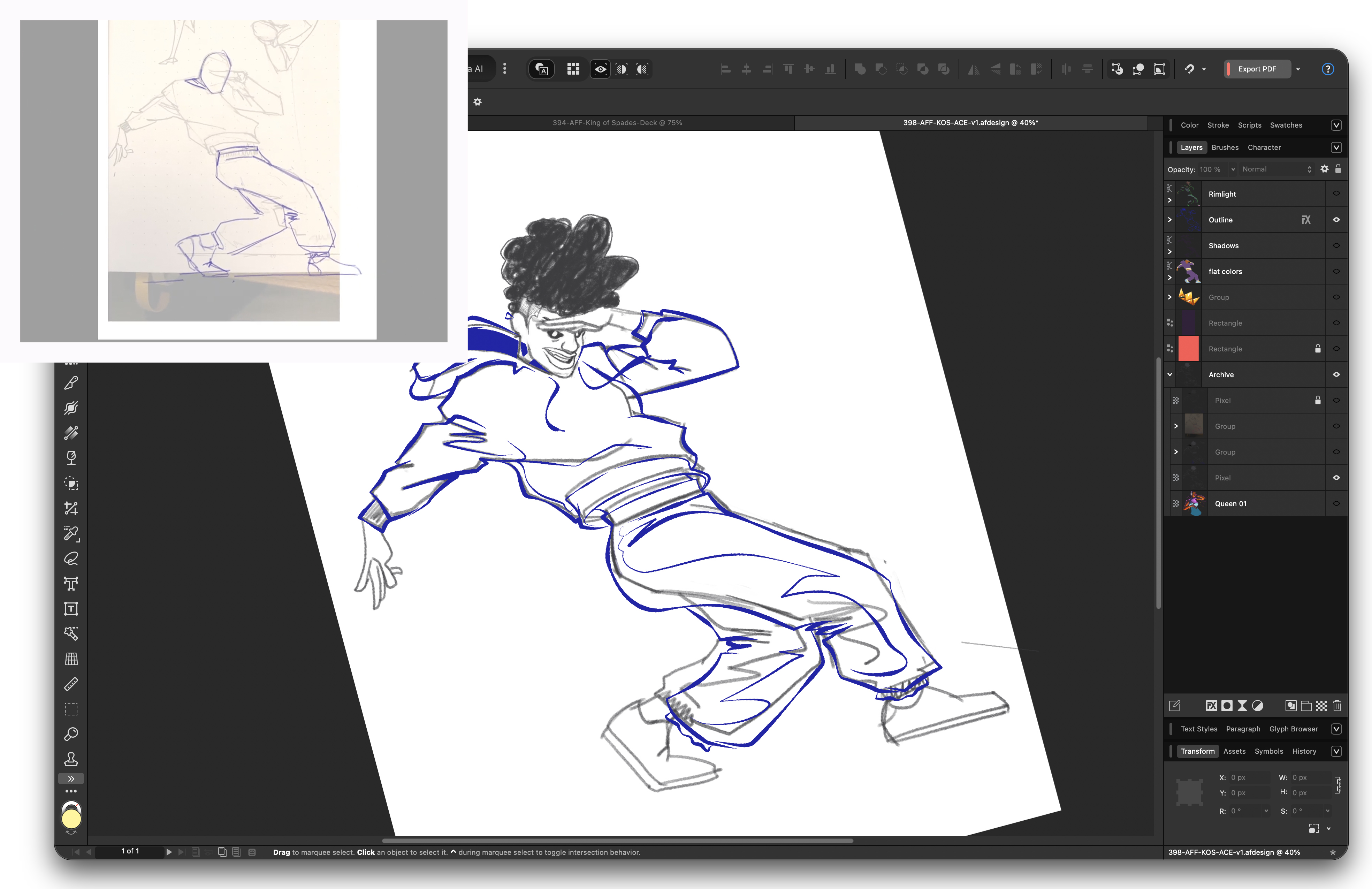
Once the sketches were finalized, the project moved into Affinity Designer. Phoenix emphasizes that the sketches were merely a foundation. "Getting the illustrations to work once flipped was one of the biggest challenges," he admits. "I had to constantly consider how shapes and poses would interlock. Every illustration required significant adjustments as the visual system evolved."
Phase 3: The Color Palette
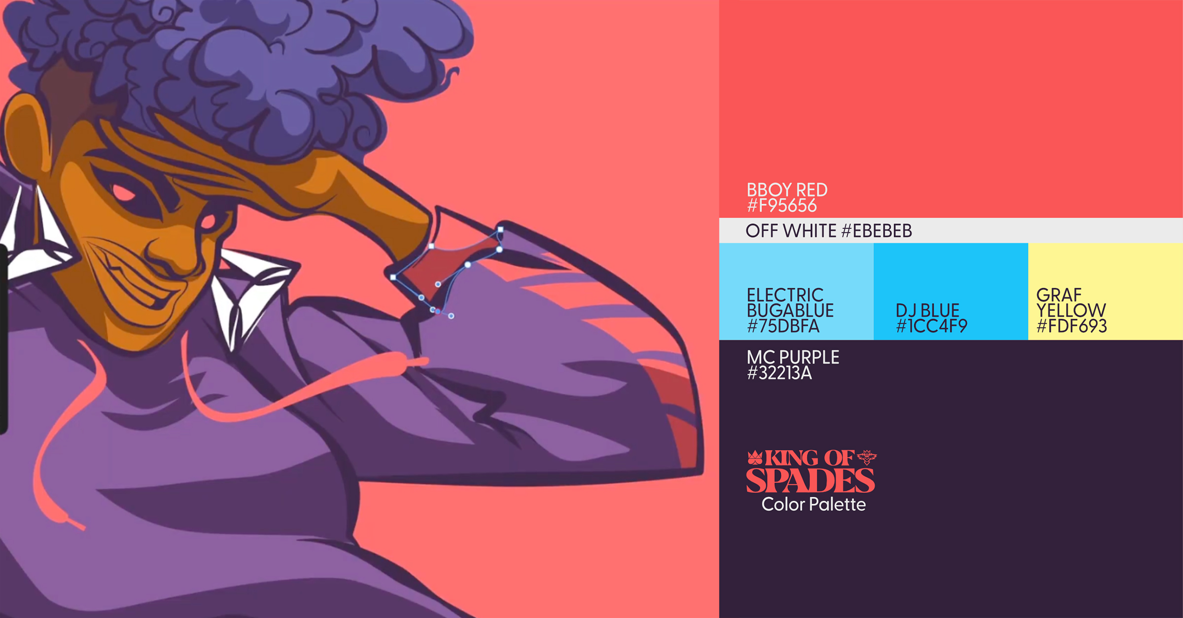
The color scheme was intended to mirror the intensity of hip-hop. Phoenix settled on a striking, high-contrast palette. A rich, mid-luminosity red sits at the center, appearing almost muted on its own but igniting when paired with a deep, moody purple. These primary tones are supported by a dull yellow and a vibrant, electric blue for highlights, with off-white typography providing the necessary negative space.
Phase 4: Textures and Final Flourishes
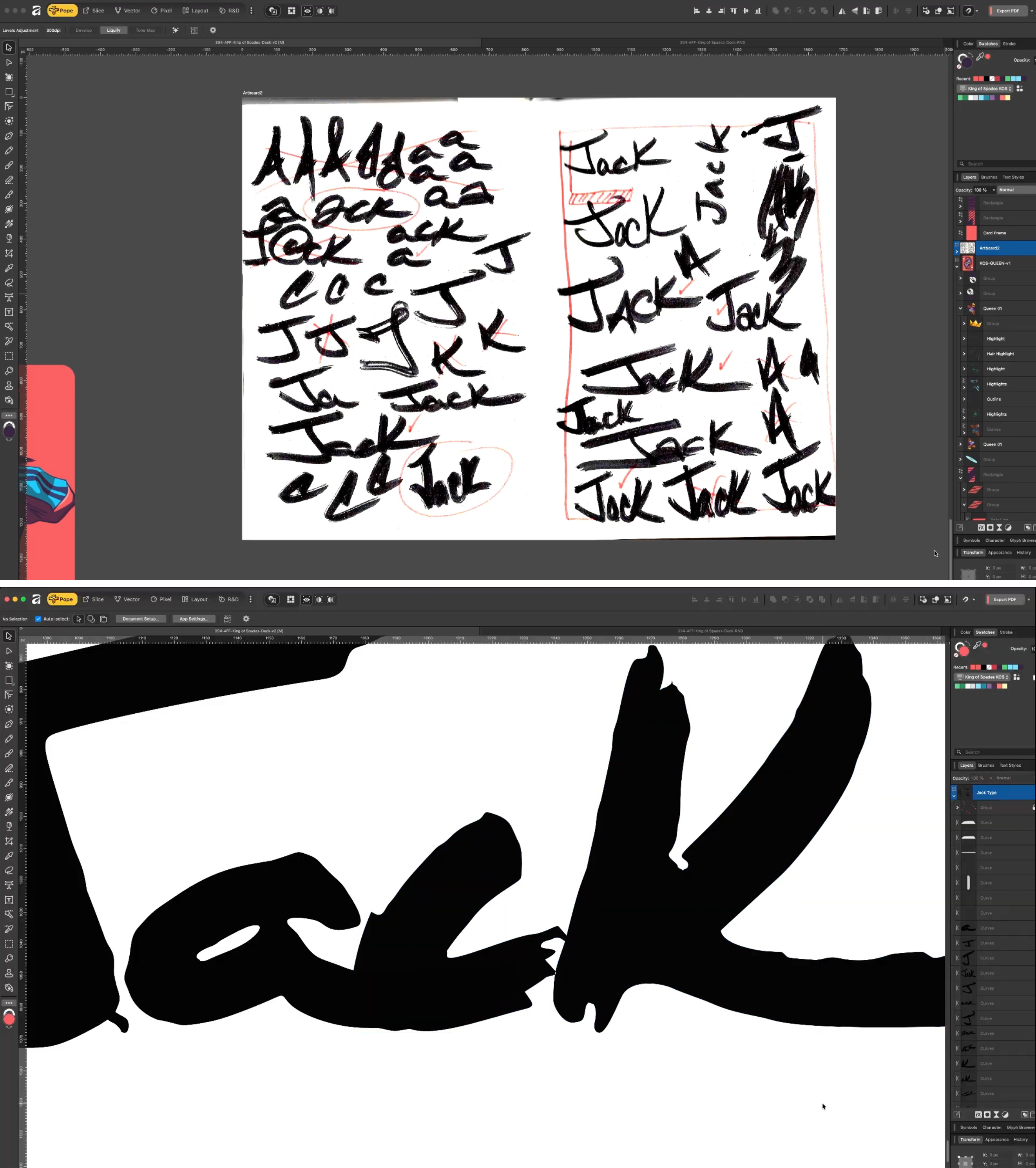
To ground the digital artwork in the grit of the street, Phoenix utilized custom brushes from True Grit Texture Supply. The lettering—specifically on the Jack—was hand-drawn using a modified Tombow marker. By roughening the nib with a razor blade, he achieved an imperfect, expressive quality that echoes the work of legendary designers like James Victore. The spray-paint textures were the final step, adding a chaotic, authentic energy to the otherwise precise vector work.
Supporting Data: Technical Lessons for Designers
Reflecting on the technical aspects of the project, Phoenix identified a critical takeaway for future iterations: the power of "Symbols."
"The next time I do a project like this, I’ll build a dynamic template system from the start by converting the final layout into a Symbol," he explains. In Affinity Designer, using Symbols allows for global updates—if a layout adjustment is made to one instance, it automatically propagates across every card in the deck. This would have saved significant time during the "building" phase of the project, where constant refinement was required to maintain visual consistency across the face cards.
Furthermore, the decision to use a mix of raster and vector tools highlights a common trend in modern professional illustration: the hybrid workflow. By using vector tools for structural integrity and raster brushes for organic texture, Phoenix managed to create a product that feels both high-end and street-authentic.
The Implications of "King of Spades"
The "King of Spades" project serves as a case study for how cultural storytelling can be successfully integrated into functional design. By choosing a traditional format, Phoenix demonstrated that innovation doesn’t always require discarding the past—often, it requires reinterpreting it.
The implications for the design industry are clear:
- Constraint breeds creativity: By adhering to the strict requirements of playing card design, Phoenix was forced to be more intentional with his artistic choices.
- Cultural narrative as a design system: The project proves that identity-based design—in this case, Afrofuturism and hip-hop—can function as a robust visual language that holds its own against traditional, minimalist design standards.
- The importance of workflow automation: As Phoenix noted, leveraging software features like "Symbols" is essential for managing complex design systems where consistency is paramount.
Official Responses and Industry Reception
The project has garnered significant attention within the design community, particularly for its use of Affinity software to bridge the gap between classic illustration and modern digital tools. While the deck began as a conceptual exercise, the community response has been overwhelmingly positive, with many collectors and designers calling for a physical print run.
For Pope Phoenix, the project was ultimately about capturing the "vibe" of a culture that is often visual but rarely codified in such a tactile way. "The deck is a collision," he says. "It’s a mix of the traditional, the digital, and the raw. It’s exactly what hip-hop is."
Conclusion: A New Standard for Custom Decks
The "King of Spades" is more than just a set of playing cards; it is a masterclass in thematic integration. By distilling the four pillars of hip-hop—MCing, DJing, Breaking, and Graffiti—into a cohesive, functional, and aesthetically striking deck, Pope Phoenix has set a new benchmark for how illustrators can approach legacy products.
Whether it is the carefully selected, moody color palette or the deliberate, hand-drawn lettering, every element of the deck serves a purpose. As the project potentially moves toward a physical release, it stands as a testament to the idea that with the right balance of discipline and creativity, even the most familiar objects can be transformed into something entirely new.